
About
Lumise is a auxiliary light store based in Rovaniemi, Finland.
In this project client wanted to re-do their online store and better the payment flow. By conducting a survey to existing customers we got a lot of information about what users wanted.
Our team produced a concept with clickable prototype for online store. Improving ways to find the right product and implementing a chat bot.

Valovelho
Valovelho is a feature in which customer can find right lights for their specific car. The problem with the current version is, that it’s very hard to find and it’s not very usable.
In the Valovelho chat, customer needs their vehicle model and other information for it to show you the fitting lights. Customer is also able to chat with a human if they happen to have questions.
I created a chat prototype with features from already existing Valovelho for easy use and access.
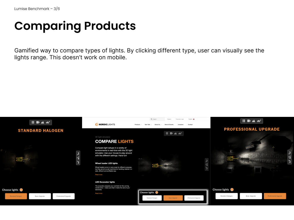
Comparing
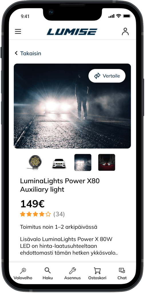


New feature that the customer wished for, was comparing products. We benchmarked other stores that have the feature and I went with floating element that comes with you when you choose products to compare. Testing showed us that users had hard time understanding what the new “compare”-icon meant so we did bigger version of the button on the product site.
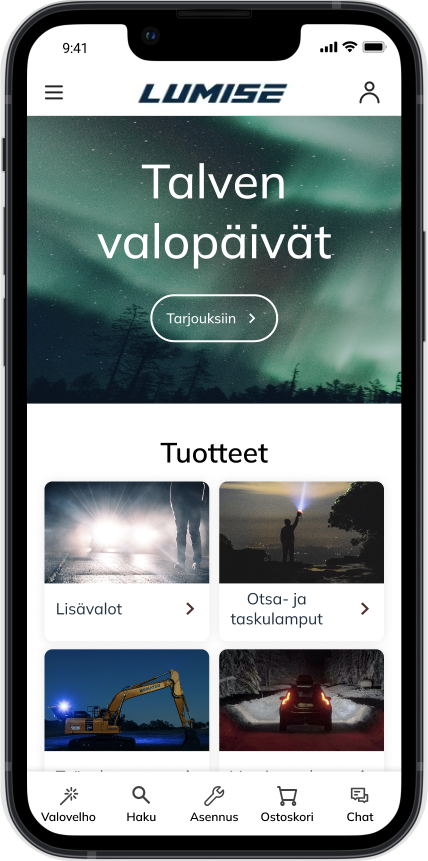
Finished product
With new concept for Lumise online store we simplified navigation options a lot and added a bottom bar to the site. Our goal was to create a modern and luxurious feeling with video in the beginning, new typography and all in all more minimal look.

My role:
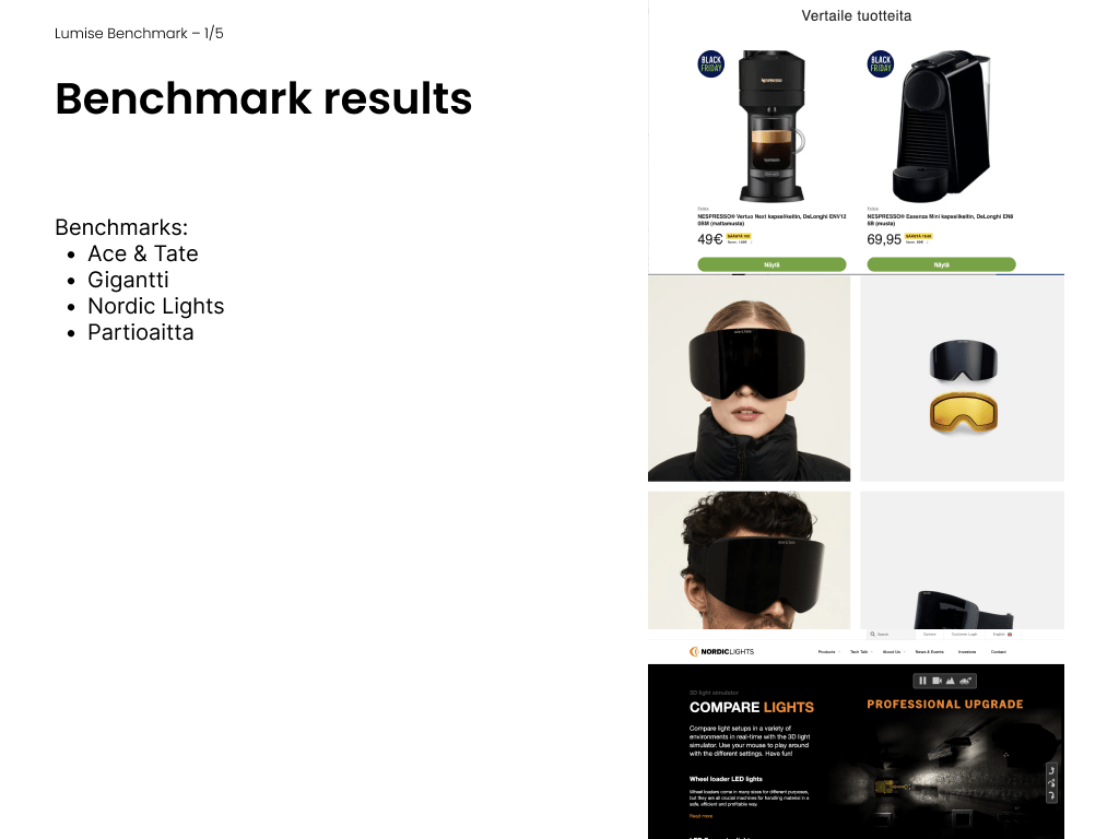
- Benchmarking other auxiliary light online stores and ways to compare products
- Making wireframes, Prototyping and creating components
- Creating customer- and user surveys on SurveyPal as well as taking notes at user interviews
Mockups from Freepik
